I helped Christine design her website, and during that time discovered her beautiful work and amazing blog, where she answers readers questions. She was kind enough to let me share one of her reader questions, and her interior design advice on Decorology. Her question below comes from a reader with a log cabin, but even if you don't have a log cabin, I promise you you will learn a great tip from Christine's response.
See below:

Tracey's cabin living room
Hi Christine:
I love your blog and the styles that you recommend, I was wondering if you had any suggestions for our living room area. We have a log home and it just seems right now we are over powered with red and honey colour from in the walls and also the furniture we had from our last place.
There is one sofa I have fallen in love with, it is the Morgan sofa from American Leather (I have attached a pic), I am basing my changes to the living room using that sofa and hopefully being able to keep my current area rug.
I have no idea what to do for art, coffee table, drapes and blinds, and possibly the area rug.
I was thinking of doing Hunter Douglas Architella honeycomb blinds on the window for a layer and helping with the heating and cooling, is this a good choice given our style of home?
I am also attaching pics of our dining room which is very open directly beside the living room, as I would need to match up the windows etc.
Thank you so much, I look forward to hearing from you.
- Tracey
Hi Tracey.
First of all, I want to say what an amazing property you have here. I love it! I am having some super jealousy as I look outside the windows of my suburban California home and see the lovely view of a fence in the back and neighbors in the front. With that said, we can make it MUCH better!
I made a mockup of your floor plan like you have it now:
And of how I think you should have it:
Let me show you a few of the whats and whys...
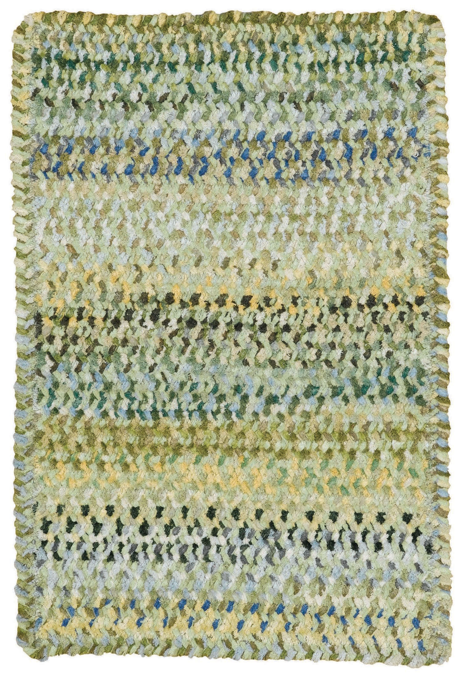
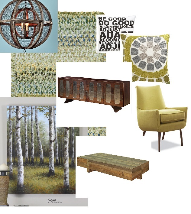
Well- your rug, where to begin??? It's too small, and the color red is all wrong with the wood floors and walls. I think of it like this, you have orange and yellow undertones in the wood. (orange in the walls and yellow in the floors) Opposites on the color wheel are going to be greens and blues. Go with opposites. You are working on an analogous color pallet right now, reds, oranges and yellows. With browns, it is not working. A teal would be great. Blue would be great. Green would be great. Can you see how a green would pop so much, and a red disappears? The red almost clashes with the wood floors- which is crazy- because who would think any rug would clash with wood floors... I picked out a new rug for you. I love braided rugs in cabins. This one is from Capel, which is my go-to source for braided rugs. It is a braided chenille, giving it such a cozy texture. I would also see just how big you can make it fit. I would shoot for a 9 x 13. Can you see the difference a large rug makes in the two floor plans above? Especially when you are floating a seating arrangement, like you are, a large rug helps to "ground it". It also goes a long way toward warming up the space, making it more inviting.

I love to throw in the unexpected. And so, I went to Scandinavian Designs for your chairs. A little retro is fun and whimsical, and looks a lot more like you had the room professionally done, (which you can tell everyone you did if you do exactly what I say!) because the average homeowner would have gone to Pottery Barn instead.

OK Tracey, let's talk sofas. The sofa above is the one that you love. Is there anything wrong with the sofa? No. However, I just kind of hate to see people purchase things that were super popular ten years ago. Is it out of style? No. But it is not a "Classic" that will be in style forever. It has aStyle Lifetime that is in menopause. Does everyone remember the chair that has this exact arm being on the cover of every Pottery Barn magazine in 1999? So whereas the style is all right- when it has already been trendy for more than ten years, its style might not have the longevity that the new piece of furniture will have. It's like the girls who finally got the Jennifer Anniston Friendshaircut from 1995, in 2005.... I would rather you got something that was more "today"- I went to the same manufacturer that you had selected, and found the sofa below:

I also would stay away from more brown in your place. There is some serious overload going on there. I would get the sofa above in a shade of gray. Darker or lighter, gray would look great.

Your current drapes are so drab, I could hardly see them. They are hung too low, and need to be much brighter. I would love to see a bright white like the Pottery Barn drape above, in a much longer length. I would then go to Kravet or Robert Allen and find a coordinating fabric tape to have sewn down the vertical length of the drape to add a bit of color and personality. The honeycomb blinds will be great. I love how you can do a top down bottom up option with them. They are very insulating, super practical, and have a low profile when up. I would use a subtle darker color like their sage gray. (Of course you want to take samples to your home to see if it really looks great next to your wood). This is NOT where you want something bright that you draw your attention to. I would prefer that they disappear.

I threw in a few contemporary throw pillows from CB2. Keep your stationary fixed items, like hardwired lighting fixtures, consistent with your cabin style; but throw in the unexpected in a few furniture choices and pillows.
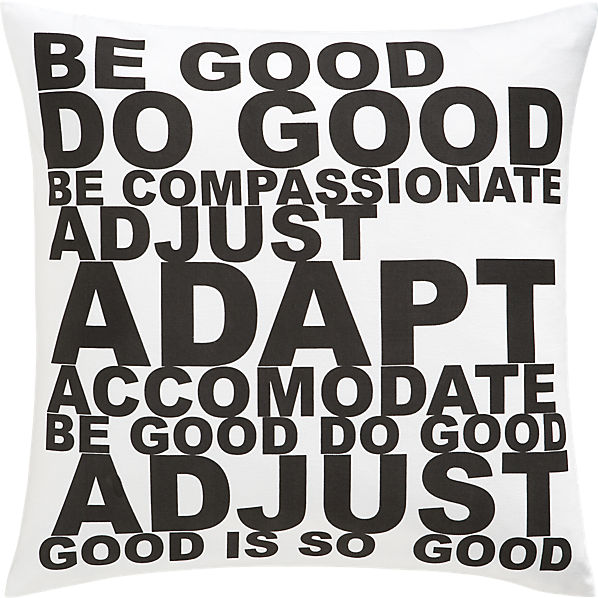
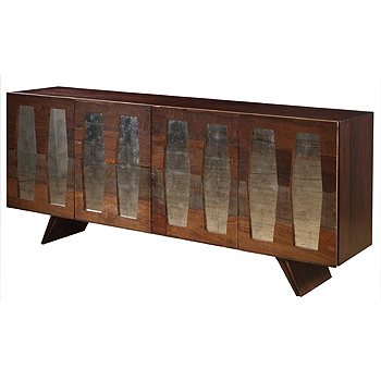
Walking toward the back of your sofa, it is just asking for a table there. I frequently find "sofa tables" to actually be too small. I like a nice big console table. What a beautiful view that is. So much more inviting than the back side of a sofa. Plus, you have a place for a couple of lamps. We should never forget our lighting.


I loved this Tomi lamp from Uttermost. It has the log look , that says, "Hey, that lamp that belongs in your log cabin." Without being all cheesy like a typical cabin lamp:
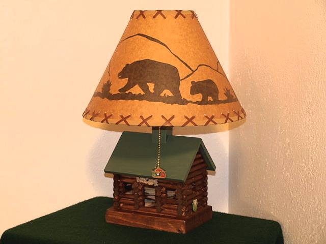
OK- that lamp above really does make me laugh out loud. Does anyone else find cheesy cabin decor as funny as I do?
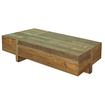 Make sure your coffee table is not too small, or get two of them. The table above is a full 67" in length, which would be great for you space. Isn't it also just a super cool table? It belongs both with your cabin, as well as the retro chair.
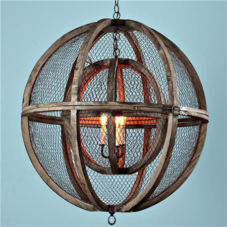
High ceilings are great to give you a feeling of openness and opulence, but they can also feel cold . I like to bring the cozy back by having hanging light fixtures that are lower. Hang a cool light fixture over your seating area. Center it with the fireplace, hanging it right above your coffee table. The fixture above is from Shades of Light. It also comes in a smaller size. You could even do a collection of three, hung at graduated heights, two small and a large. It would look very cool. In the same way that the area rug helped to ground the floating seating area, a hanging light does the same thing.
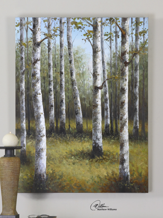

We also have to address your mantle. Go with a piece of art that is vertical in orientation, and has some color. Yes, I happened to find the perfect piece for you. It is birch tree piece from Uttermost. Some of the pieces I selected for you are very typical for a cabin; this is one of them. I love the combination of those with the unexpected, like the chair from Scandinavian Designs. And yet the colors in this piece will help all of it to pull together perfectly.
OK- so there you go- what do you think?

How amazing is her advice?
See more of Christine's reader questions and solutions at her blog, Design With Christine.

No comments:
Post a Comment