I was a tad late getting to the party, but I made it to the 5th annual Holiday House benefitting The Breast Cancer Research Foundation. It was founded by Evelyn Lauder. The portrait in the foyer was a fitting tribute to Evelyn, who lost her life last year due to ovarian cancer.
I was having a déjà vu moment upon entering the house. I realized it has been held in the same upper east side mansion each year. Designers are given a holiday, or choose a theme with which to base their designs.
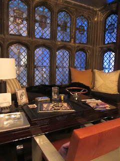
Geoffrey Bradfield was inspired by Marcel Proust's Rememberences of Things Past. The past and the present co exist in the kind of room Geoffrey does best. His interiors are airy, functional spaces with a sculptural quality. It was opulence in black and while.
I like a designer with a sense of humor. You'd better have one in this business! This bust was in the fireplace and appeared to have had a pie thrown in its face.
Ally Coulter's Father's Day den is a dream for any testosterone filled man about town. Ralph Lauren would be proud. You could move right in; everything was picture perfect and slightly sparkly.
The house has such strong architectural lines, and the dining room with its decorative barrel ceiling is a showstopper. It was appropriate that Inson Dubois Wood created a Venice carnavale like feeling with it's riotous mixture of art and high/low layering.
Ironically, I did detect a gun theme. I liked the unexpected placement of the light fixture on the table. Dramatic? Yes! Practical? No! Who says show houses have to be practical? I think lighting these rooms was an issue.
Upstairs, Dineen Architecture and Design had the task of creating a room based on Mother's Day. I found it interesting that they chose to do it in a slightly masculine or non-gender specific way. It was just clean lined and well curated. Each detail was exacting. A space where any woman could relax and rejuvenate.
Dyfari Interiors gave a tiny room impact, suggesting it was an ode to her father. A master tailor with a penchant for the feminine? I could picture him down on the lower east side toiling away. I like that a frame corralled the different colored threads and it became more than the sum of its parts. You were suppose to feel enveloped in a men's suit with the Phillip Jeffries herringbone fabric wall covering.


No comments:
Post a Comment